EFE | 401k Enrollment
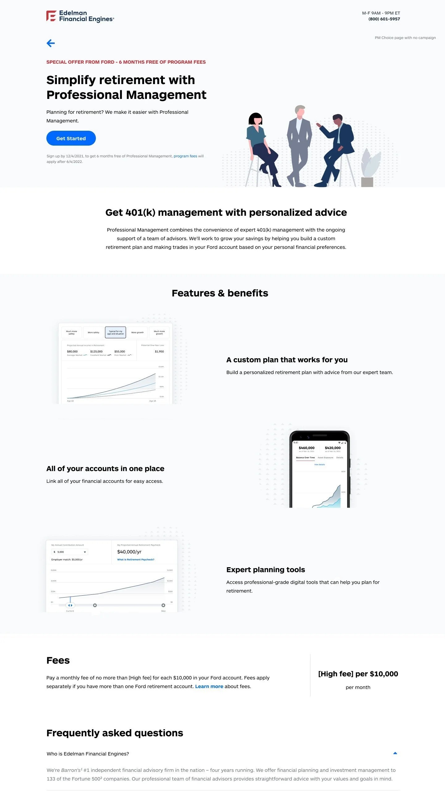
Simplifying a convoluted enrollment process and helping users feel assured in their finances.
Leading content design on a team that designed an updated enrollment experience for 401k plan participants.
The project
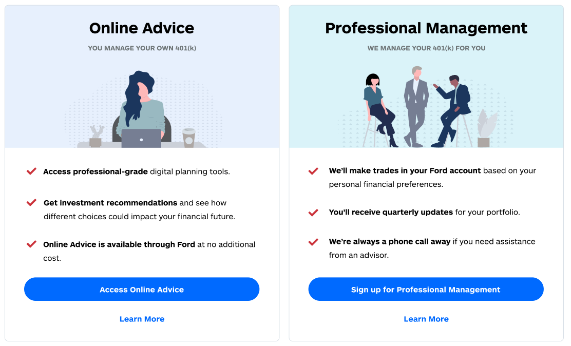
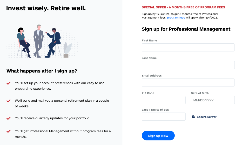
Improve pathing with clear calls to action (CTAs), communicate value propositions to showcase user benefit, and increase trust in the brand.
Background
Edelman Financial Engines is an American financial planning and investment advisory firm with over $260 billion in assets under management and more than 1.2 million clients. The company has two main business facets: Workplace and Retail. This project sought to reimagine the Workplace Enrollment experience after a baseline usability test uncovered several pain points.
Audience
EFE targets employers and their employees in their Workplace 401k management offerings. We designed this release for employees looking to activate and enroll in their company 401k plan.
Discovery
Discovery included a deep-dive into the existing experience and user testing data to identify areas of opportunity in the product. I used Miro to compile my findings and supporting data, culminating in a presentation to stakeholders where I identified 6 areas of improvement. These included trust, CTAs, value propositions, visual design, fee transparency, and personalization.
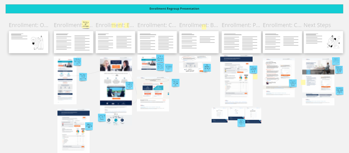
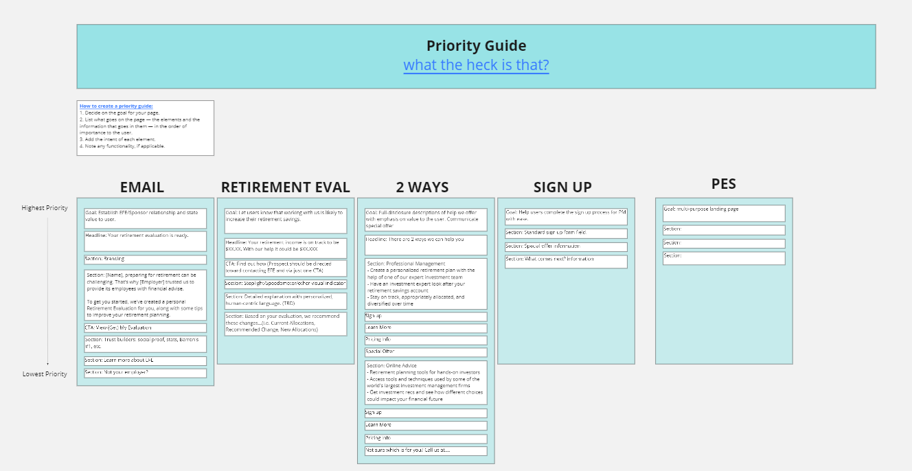
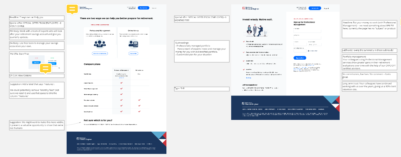
Once aligned with stakeholders, I partnered closely with a UX designer and Product Manager to ideate a new experience. I advocated for the use of Priority Guides which list content and elements in order of importance to the user. I used Miro to create a Priority Guide, which helped position content strategy at the center of our creative process. We worked in close collaboration with business stakeholders, following a 2-week Agile sprint structure with weekly design reviews. The UX Designer and I used Figma to create high-fidelity wireframes based on the Priority Guide. After 2 sprints, we finalized a prototype for user testing.
User testing
After preparing an interactive prototype, we partnered with the Customer Insights team to run 2 usability tests: one moderated, the other unmoderated.
Moderated user testing gave us impactful qualitative data that informed us of the attitudes and perspectives of our users. I learned that while I had made efforts in building trust, users were still wary.
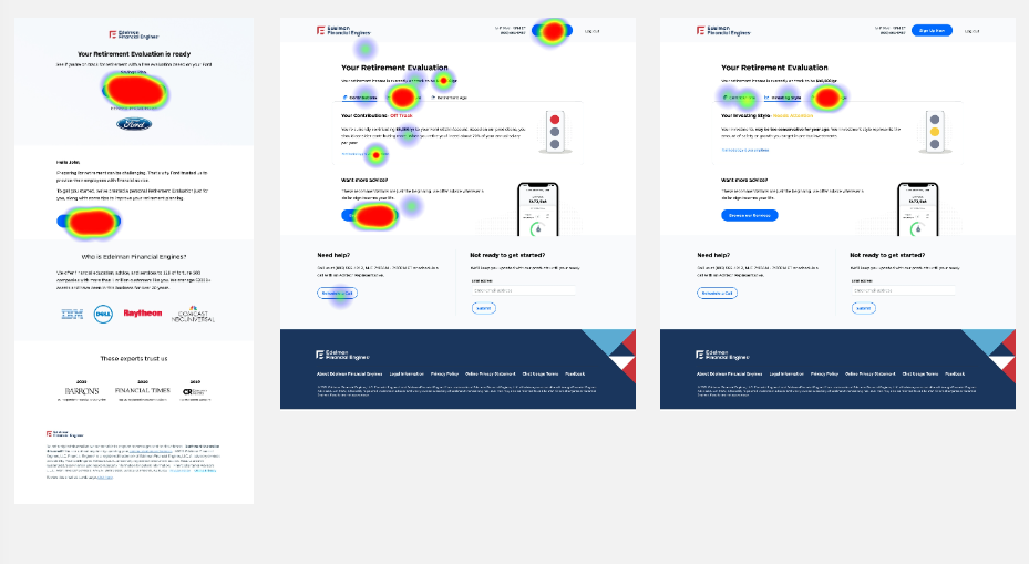
Unmoderated testing brought us dynamic heat maps that highlighted where users’ clicks were concentrated. This was incredibly helpful in identifying opportunities for grabbing a user’s attention.
Once this data was compiled and analyzed by the research team, we were relieved to find that responses had improved significantly compared to the baseline usability test. But, there was still some tweaking to do before handoff.
Results
In just a few months, we delivered new screens and content for the Workplace Enrollment experience. At the time I moved on from EFE, these changes were still in production — but I was lucky enough to have a colleague follow up with me upon their launch to let me know that the release was a success and elevated engagement metrics.